Your Logo Isn’t Your Brand: What Your Business Actually Needs to Look Professional
Your logo is important. It’s the thing people see on your website, business cards, social media, invoices, signs and maybe even the side of your vehicle. So it’s understandable that when a business wants to look more professional, the first thought is often, “We need a new logo.”
Sometimes that’s true.
But a logo, by itself, isn’t your brand. Your brand is the overall impression people get when they interact with your business. That impression comes from your appearance, your words and the experience you give people. Your logo helps introduce you. Everything around it helps people understand you.
So What Exactly Is a Brand? Think about a business you recognize immediately. Maybe you can picture its colors. Maybe you recognize its advertising before you see the company name. Maybe you know what kind of experience to expect when you walk through the door. Those familiar details are part of its brand. For a small business, the same idea applies. Your website, social posts, printed materials and everyday communication all contribute to how people see you. You don’t need to be a national company to benefit from a recognizable, consistent identity. You just need the different parts of your business to feel like they belong together.
Consistency Makes a Big Difference
One of the easiest ways to look more professional is to be more consistent. If your website uses one set of colors, your business cards use another and your social media graphics look different every week, people may have a harder time recognizing your business. Each piece might look fine on its own. Together, though, they can feel disconnected. Consistency gives people familiar details to remember. It also makes everyday decisions easier because you aren’t starting from scratch every time you need a flyer, a post or a presentation. That doesn’t mean everything has to look identical. You can vary layouts, photos and messages while keeping a few recognizable elements in place.
You don’t need a complicated color system. A main color, a supporting color and a few neutrals are often enough to give your materials a consistent look. The useful part is choosing specific shades and using them regularly. “Blue” can mean dozens of different things. Saving the actual color values helps keep your website, social graphics and other materials closer to the same appearance. Think about how those colors work in practice, too. Text needs to be easy to read, and your colors should work on both light and dark backgrounds. A color can look great in a logo and still need some adjustment when used behind a paragraph of text.
Keep Your Fonts Under Control Fonts contribute more to a business’s appearance than people sometimes realize. Using a different font on every graphic can make your materials feel inconsistent, even when the logo stays the same. A simple approach is to choose one font for headings and another for regular text. Depending on the fonts, one family with a few different weights may be enough. The priority is readability. A decorative font might work well for a short heading, but it may become tiring to read in a longer paragraph. Small print on a flyer needs a different kind of attention than a large title. A few dependable choices will usually serve you better than a new font for every occasion.
Your Photos Are Part of the Picture Photography also shapes how people see your business. Imagine a website with bright, natural photos alongside social posts filled with dark, heavily filtered images. Even with the same logo, the overall appearance can feel uneven. You don’t need every image to come from the same photo shoot. But it helps to think about the style you want. Are your images warm and approachable? Clean and straightforward? Focused on your work, your people or your products? Clear, relevant photos can help people understand what you do. Real examples of your work often communicate more than a generic image that could belong to almost any business.
The Way You Write Matters, Too Your brand also comes through in your words. If your business is friendly and approachable in person, your website should probably sound that way. If your customers value direct answers, overly formal language may make the experience feel less natural. Think about how you explain your business during a normal conversation. That’s often a useful starting point for your website, emails and social posts. You can adjust the wording for different situations without changing your personality. A LinkedIn post may be more polished than a Facebook caption, but both should still sound like they came from the same business. Clear language helps people understand you. Consistent language helps them get familiar with you.
Looking Professional Doesn’t Have to Mean Looking Corporate
Professionalism looks different from one business to another. A neighborhood restaurant, a fitness studio and an accounting firm won’t necessarily use the same style. They don’t need to. What matters is whether the appearance fits the business and whether the details feel intentional. A playful business can look professional. A casual business can look professional. A small, personal business can look professional. Readable information, thoughtful design and consistent presentation can support all of those personalities. You don’t have to remove what makes your business distinctive to make it look more established.
Write Down a Few Basic Guidelines
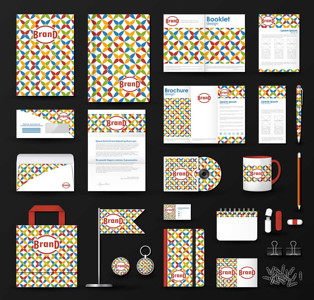
You don’t need a lengthy brand manual to get started. A short reference document can cover your approved logo versions, color values, fonts and a few notes about photos and writing style. It can also include simple practical rules, such as leaving space around the logo and avoiding stretched or distorted versions. Having those details in one place makes it easier to keep materials consistent, especially when more than one person creates them. It also saves you from having to remember which blue you used or track down the right logo file every time.
Your Brand Is Also the Experience You Give People
Visual consistency helps people recognize your business. Their experience helps shape what that recognition means. The way you answer questions, handle problems, follow through and treat customers all contributes to your reputation. If your materials promise a friendly, dependable experience, your everyday interactions should support that promise. A polished appearance can make a good first impression. What happens afterward gives people a reason to trust it. Look at the Whole Picture – Before deciding that your logo needs to change, take a look at everything around it. Do your website and printed materials feel connected? Are your fonts and colors consistent? Do your photos reflect your business? Does your writing sound like you? You may discover that the logo is doing its job and the surrounding pieces need more attention. A few consistent choices can help your business feel more organized and easier to recognize, without changing its personality.
A good brand isn’t just something people recognize. It’s something people understand.